Visualize API scores with School Performance Maps
Sep 15, 2007 08:54 PM Filed in: Info
Recently a friend pointed out this cool site to me. It provides
a map interface to look at California school API
scores. A picture is worth a thousand words,
so...
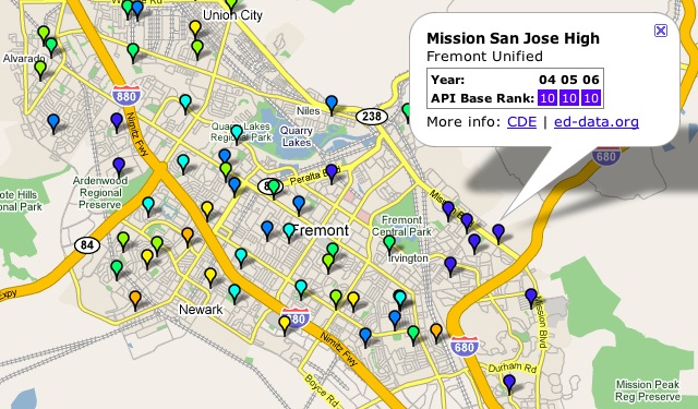
Each pin corresponds to a different elementary or secondary school. The colors represent their average API base rank from 2004 to 2006. I clicked on the Mission SJ High School pin above.
Click here to see the map above.
CAUTIONARY NOTE: School API scores are but one measure of a school's performance and a volatile one at that. It doesn't take much for a school's score to change by 10-50 points. I encourage anyone interested in a measuring schools to visit the school. Talk to the principal and teachers. Look at how involved the parents and community are. Those are just as important measures.
|